
The Spot Details Dilemma
Context
SpotHero is an online parking reservation marketplace that offers hourly, monthly, airport, and event parking. This project explores the problem of checkout conversion of SpotHero's monthly parking option.
Business Model of SpotHero

Goal
To evaluate the existing SpotHero monthly parking conversion and come up with an intervention that would help increase customer conversion.
My role
As the lead product designer on the project, my role entailed the following:
-
User research, testing, and analysis.
-
Collaboration with the Product and Engineering Managers on strategy and prioritization of features.
-
Brainstorm and design mock-ups.
-
Dev handoff and design QA.
-
Share findings and results across the organization to create influence.
Timeline
3 months (Oct 2022 - Dec 2022)
Steps
-
Conversion Audit
-
Problem identification
-
Usability Testing
-
UI Design
-
A/B Testing and Preference Testing
-
Impact measurement
1.
Conversion Audit
"Improving conversion rates is an ongoing part process for any company, from the smallest niche purveyor to global mega-brands." - Baymard Institute
Goal of the audit
To analyze the Monthly product pages before checkout from the perspective of the factors influencing conversion.
Scale of measurement
-
Good
-
Decent
-
Mediocre
-
Poor
Pages analyzed
-
Homepage
-
Spot Listing Page
-
Spot Details Page
Source of Analysis
-
Previous usability studies
-
UX heuristic principles


Opportunities:
-
How might we improve the quality and quantity of information displayed on the Product Details Page?
-
How might we display reviews to customers?
-
How might we improve the filters on the listing page?
2.
Problem Identification
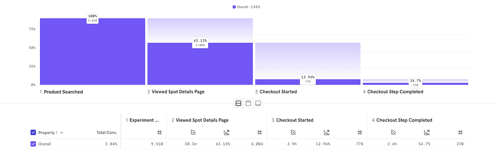
When we dug deeper into the opportunities from the conversion audit, we found out that ~90% of "monthly" users dropped after viewing the spot details page (PDP) and never started the checkout.
This was significantly less compared to other verticals..

3.
Usability Test
Research Goal:
To understand the usability, quality, and quantity of information presented to the users in the current monthly Product Details Page, to get insights into the conversion rate for monthly.
Research Questions:
-
What do users think of the information displayed on monthly spot cards and spot details?
-
What factors would prevent the users from abandoning the flow before checkout?
Participants:
6 Non-SpotHero monthly parkers
Results
1st fold

Users found the following to be the most important information on the PDP:
-
Access hours (6/6 users)
-
Amenities (5/6 users)
-
Distance (3/6 users)
-
Price (3/6 users)
-
Reviews (3/6 users)
3. Distance
5. Reviews
4. Price
2. Amenities
1. Access hours
Users found the following to be the least important information on the PDP:
-
Redundant rating (2/6 users)
-
Getting there (2/6 users)
-
How to redeem (1/6 users)
-
365-day customer support (1/6 users)
3. How to redeem
2. Getting there
1. Redundant rating
4. Customer support
4.
UI Design
Hypothesis:
-
Giving users the bare minimum, most useful information upfront will help with their decision to buy monthly parking.
-
This will lower the drop rate on the Spot Details page increasing the conversion by 2%.
Baseline "A"
The existing design
Design option "B"
The bare minimum variant

Changes made:
-
Removed or hid the content that the users didn't find useful.
-
Rearranged the order of the content as per the information the users valued.
-
Widened the PDP container to accommodate more information upfront.
-
Added more padding around the content to make breathing space.
-
Relabelled the CTA as "Proceed to Checkout".
-
Anchored the price and the CTA to the top as the user scrolled.
Design option "C"
The new page variant

Changes made:
-
Opened the PDP into a new tab.
-
Rearranged the order of the content as per the information the users valued.
-
Kept all the information from the baseline but hid it behind a dropdown.
-
Presented the most important information to the user by dividing it into two columns above the scroll.
-
Give more prominence to the garage name.
A/B/C Test results
-
The A/B/C test was conducted on 3 different versions released to production using Optimizely.
-
The results were tracked via Mixpanel.
-
The test ran for 1 month and 15 days to reach the desired statistical significance.
Mixpanel tracking by Stephanie Lona - product manager

-
As per the results, variant C - the new tab variant had the best checkout started conversion at 14.9%.
-
However, that same variant had the lowest checkout completed conversion of 30.52%.
-
The baseline had the lowest checkout started conversion, but the highest checkout completed conversion.
-
On average, variant B - the bare minimum variant did better than the baseline at checkout started conversion and better than variant C at the checkout completed conversion.
5.
Preference Test
Since the A/B/C test had inconclusive but interesting results, I decided to further investigate why that was the case.
Research Goal:
Understand why the users would prefer one version over the other and what their motivations for leaving the checkout would be.
Research Questions:
-
Would the users prefer the details page to be opened in a new tab or in the same tab?
-
What motivates the users to complete a checkout after they enter checkout?
-
What motivates the users to abandon a checkout after they enter checkout?
Participants:
5 SpotHero parkers
Results

6.
Impact Measurement
Conclusion:
Within 30 days of implementation, the conversion for monthly checkout increased from 9.4% to 12.9%.